Florence Flamingos Baseball
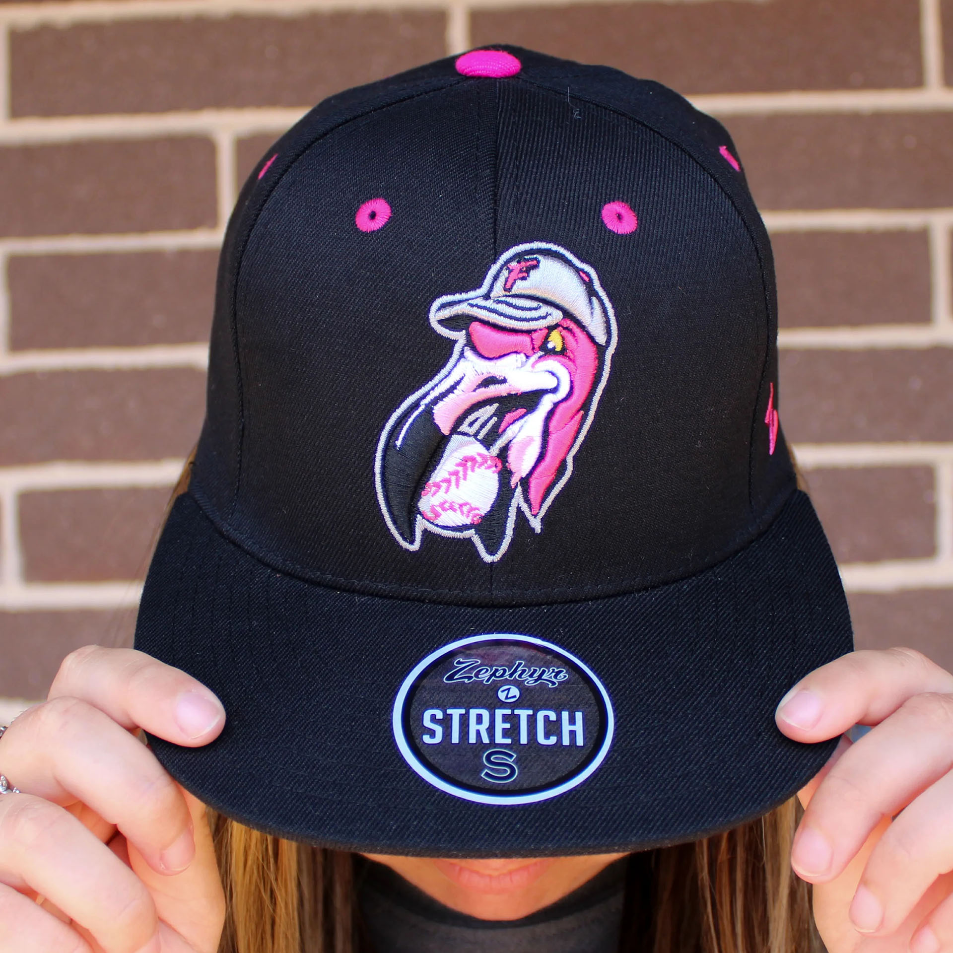
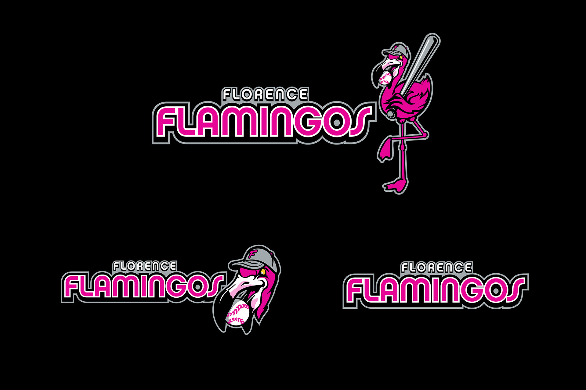
“It’s got to be pink.”
That’s what I said during the first discussion about the branding for the Florence Flamingos.
Was it crazy? Maybe.
Would it be bold? Definitely.
It was my job to make it appealing, make it dynamic…to make it work.
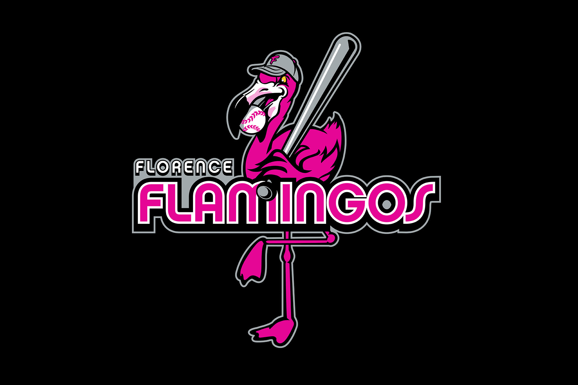
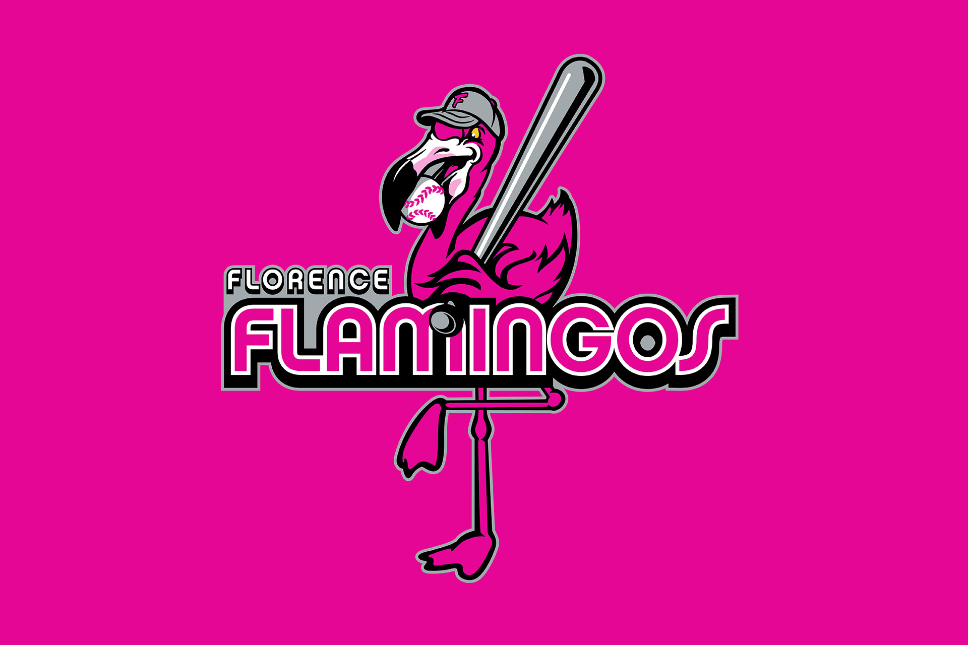
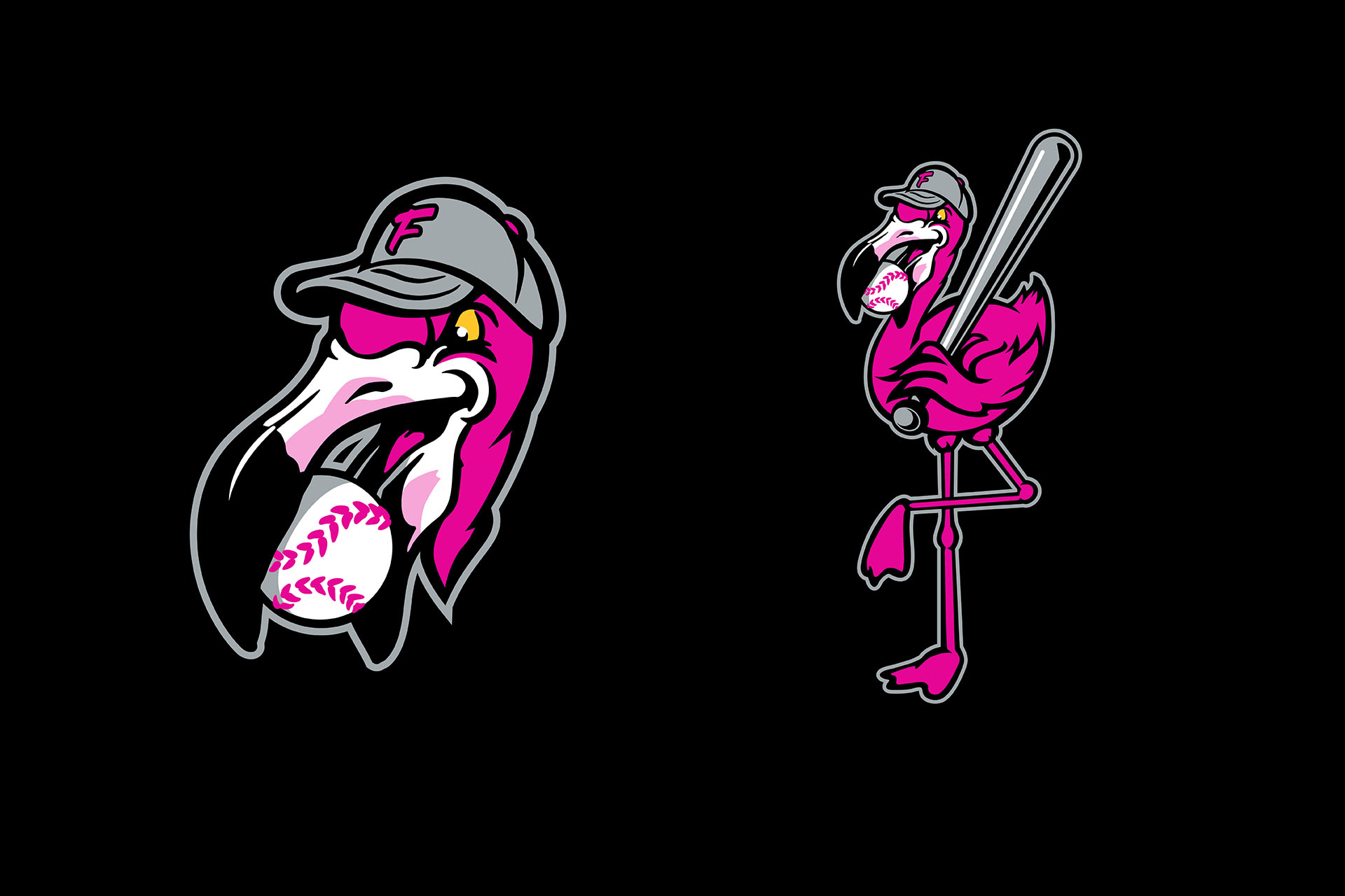
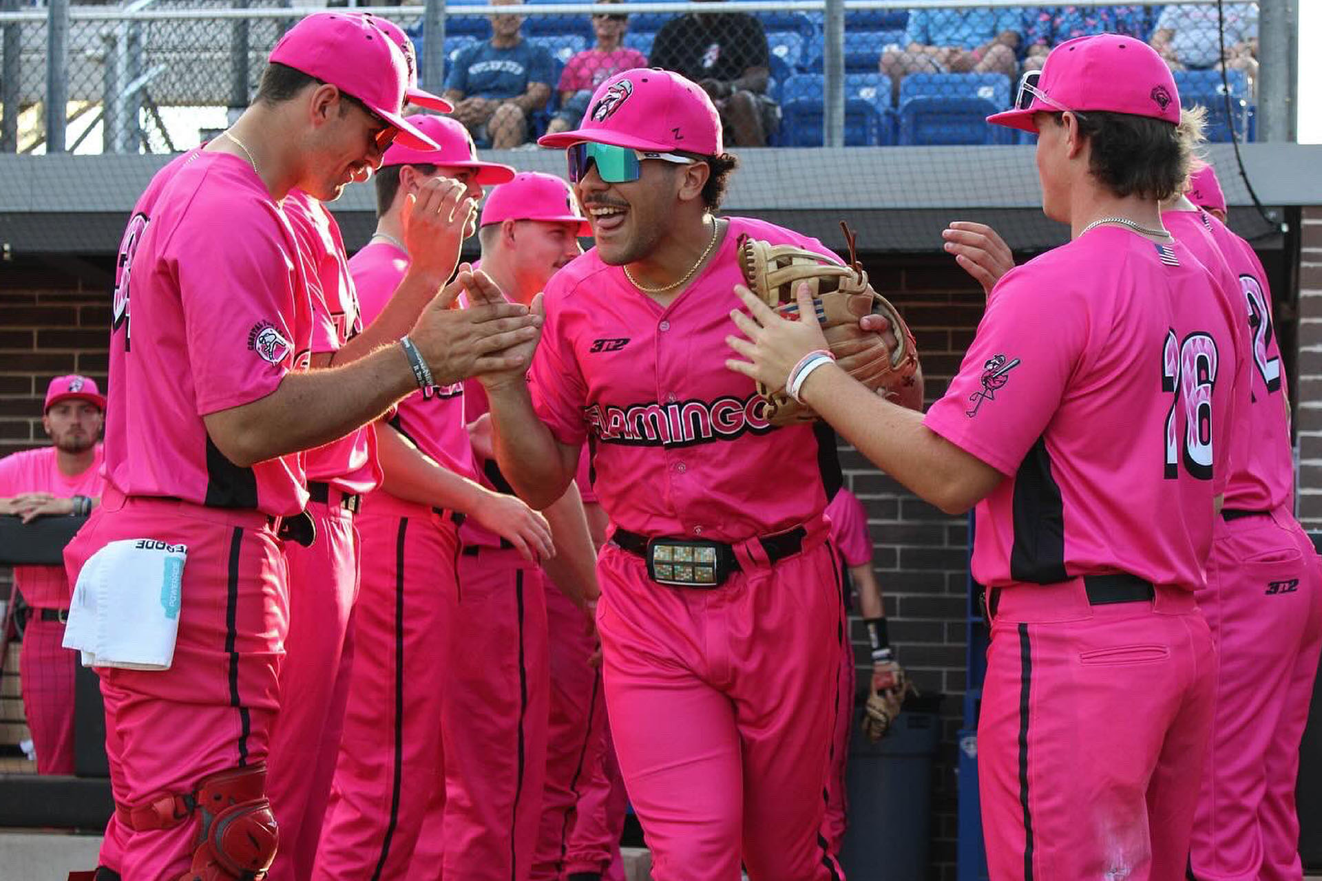
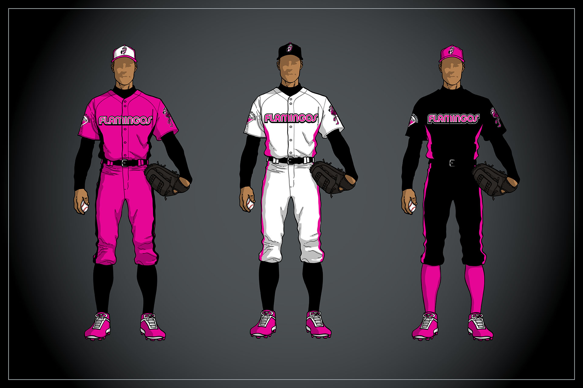
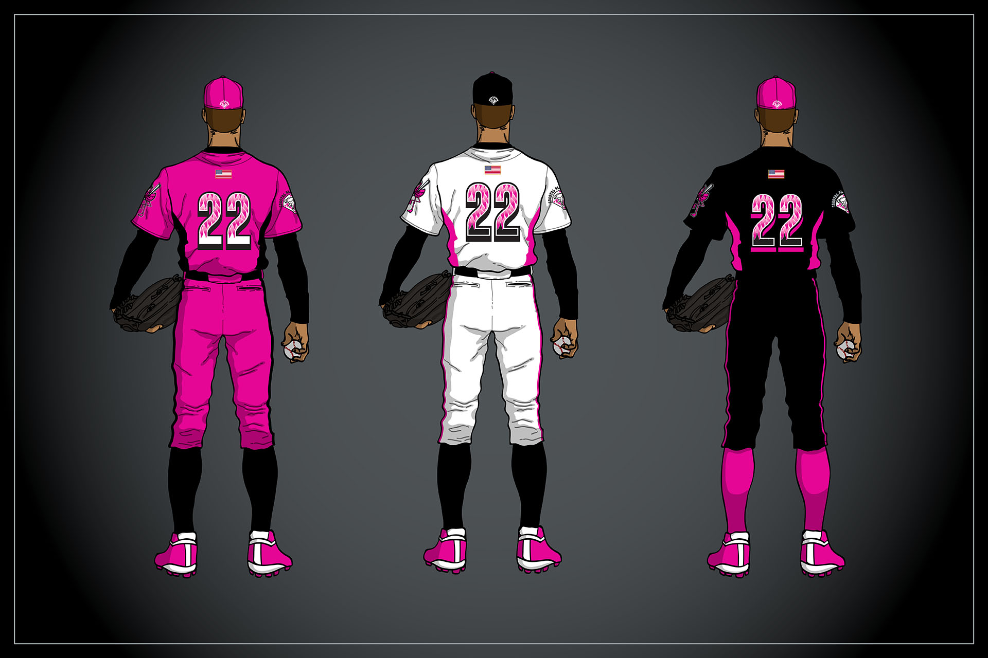
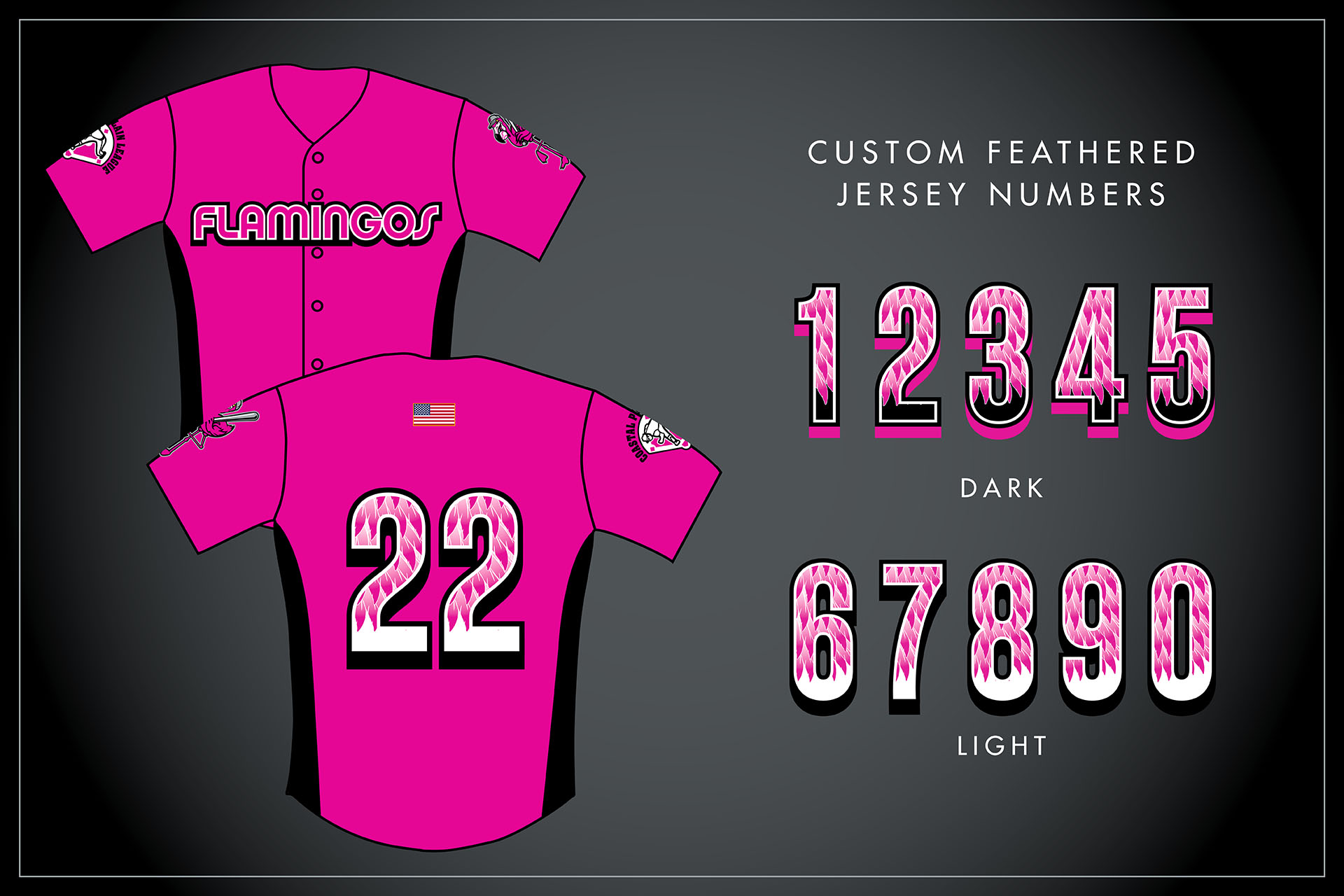
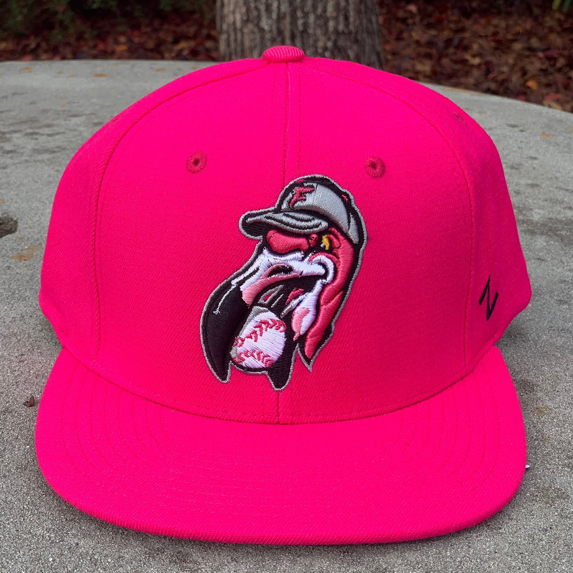
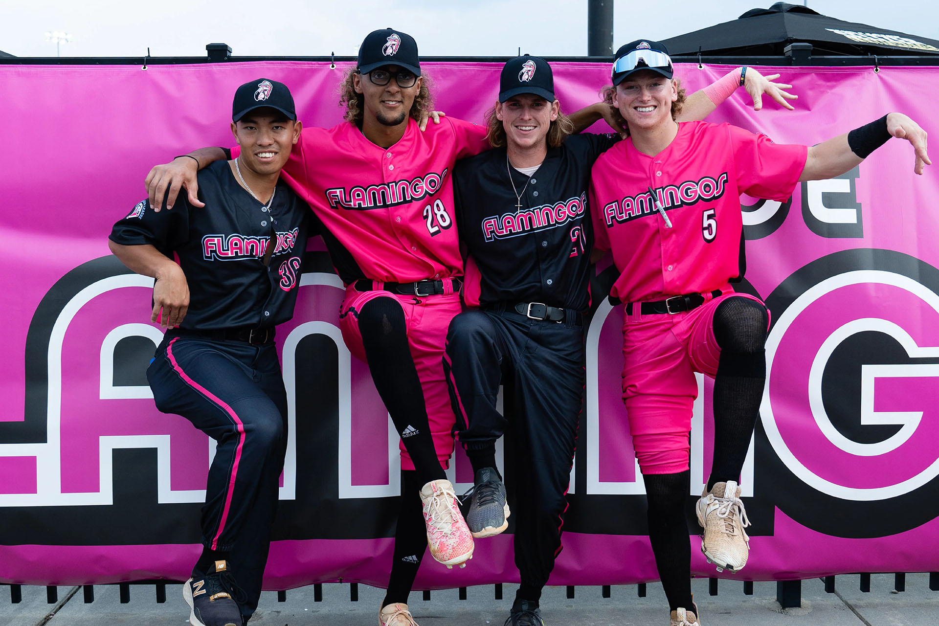
To get the right pink (Pantone Rhodamine Red), and find the right complimentary colors (silver and black inspired by real life flamingos and the wrestling livery of Bret “The Hitman” Hart). Together with a crisp logo set featuring an aggressive aviary mascot, the Florence squad looked like no other team ever when they took the field for Opening Day.
Since then their merchandise has been a consistent seller and marketing for “The Flock” continues to stand out from the crowd.
ClientFlorence Flamingos BaseballServicesBranding, Illustration, DesignOther CreditsUniform Template: Jay JacksonYear2022